
We are announcing the release of HeroMode version 5.5, which adds the final pieces to the new user onboarding experience update. We've improved the introduction sliders to better highlight the app, added zero-state usage hints to help new users get started, and introduced information centers to provide relevant functional details when necessary. Together with the adventure templates and the in-app contact support feature, we hope new and existing users alike will find it easier to use HeroMode. We're constantly striving to make HeroMode a task management system that's fun, engaging, and motivating, and we hope these updates are a big step in that direction!
It's been a few months since we conducted our first ever user survey. It was a very fruitful exercise, allowing us to build many improvements to the app. Implementing all the feedbacks took us a while, but today we are finally at a point where we feel we've checked off all the items we had planned! Specifically, over the last few months, we have introduced a brand new UI, and rolled out the Piggy Reward System to make HeroMode more motivating. We even converted a user from a Piggy non-believer to a Piggy advocate, completed with data and plots and all!
Today, with the release of v5.5, we have also completed the update to the new user onboarding experience. There are many pieces involved, so let me break it down!
Introduction Sliders
When you first open HeroMode, let it be the iOS app from the app store, or the web app from your browser, or the HeroMode chrome extension, you will be greeted with a series of introduction sliders.
Over the many iterations of HeroMode, we have learned that these sliders serve a very important purpose. They are the first impression of the app, but yet also a blocker between the new user and the actual value of the app. That means the sliders better have some actual value on their own: they should be informative.
So we have updated the sliders to (hopefully) make it more clear what HeroMode can do for the user.
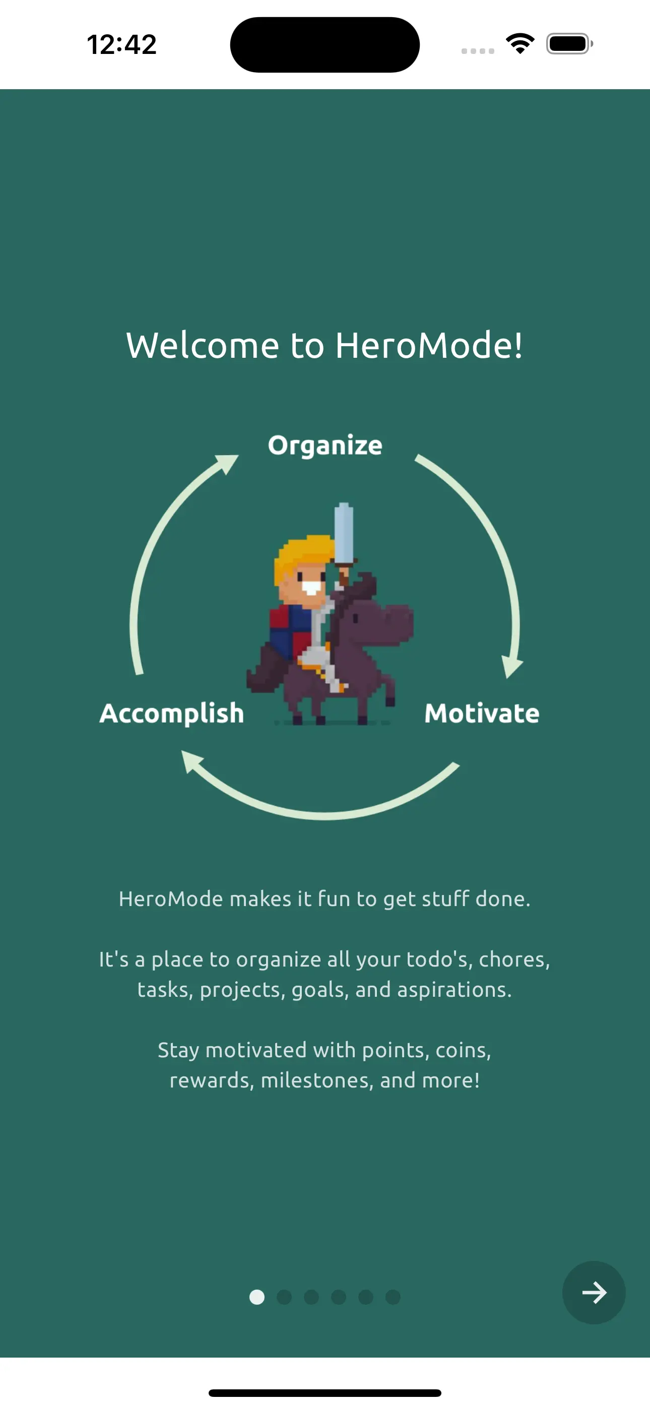
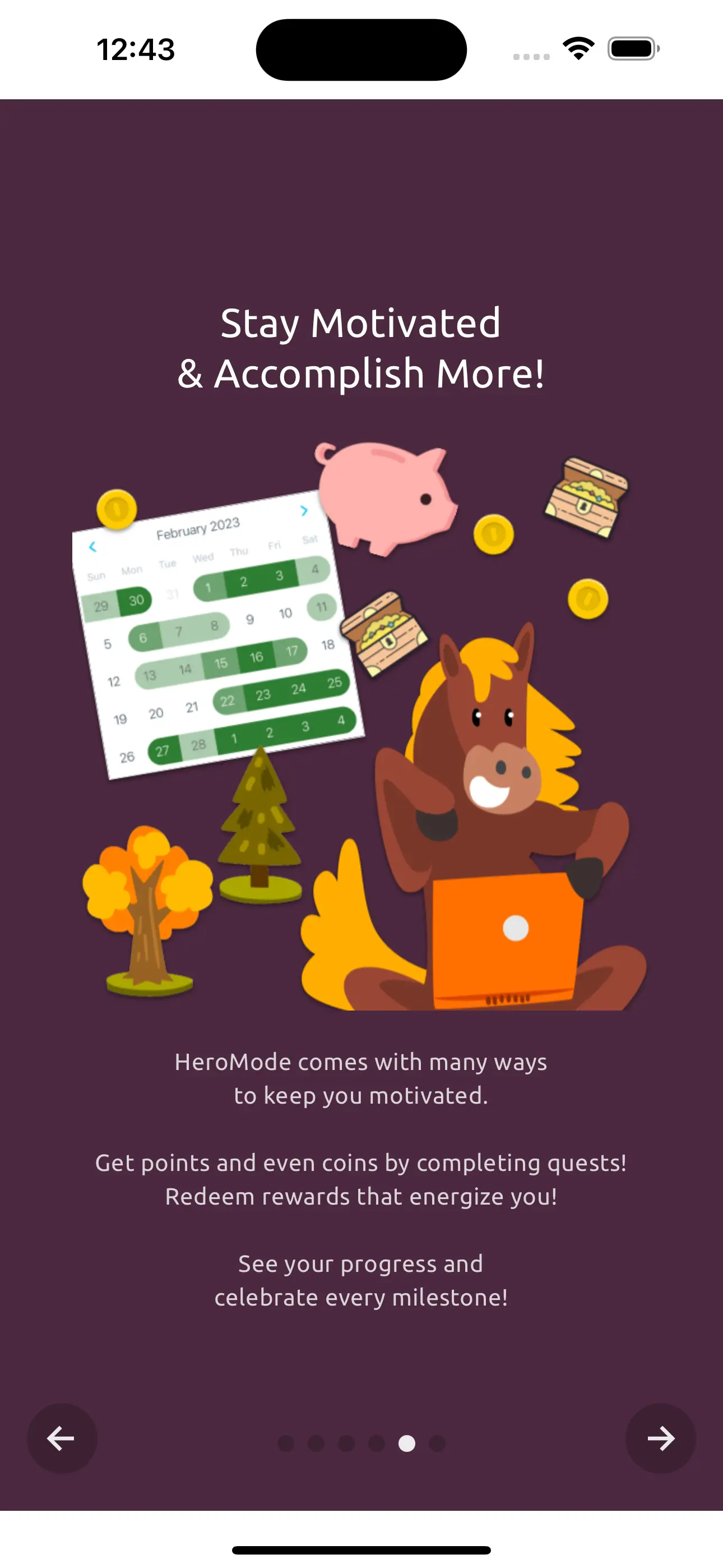
Above: Examples of updated introduction slider.
For example, we are simplifying how we present HeroMode: a task manager that helps you to:
- Organize
- Motivate
- Accomplish!
This is a virtuous cycle that we hope to help users achieve with HeroMode. This also means replacing one of the less informative sliders with a new one specifically on the motivation features, as motivation is a key part of this cycle.
Zero-State Usage Hints
After the introduction sliders, and after the new user signs into HeroMode for the first time, the user would arrive at the "zero state". This is the state where the user is now in the app, but has no quest and no adventure yet.
In the past, we used to give user an option to create the "Orientation" adventure, which comes with several quests that teach the user how to use HeroMode. We even actively encouraged new users to go through the orientation adventure.
However, none of the new users who went through the orientation adventure ever enjoyed it. We constantly heard the feedback that the orientation adventure feels like extra work, and yet another barrier before they get to the value of HeroMode.
So the orientation adventure is now gone! Instead, we simply show a very light hint on each screen to help the user get started.
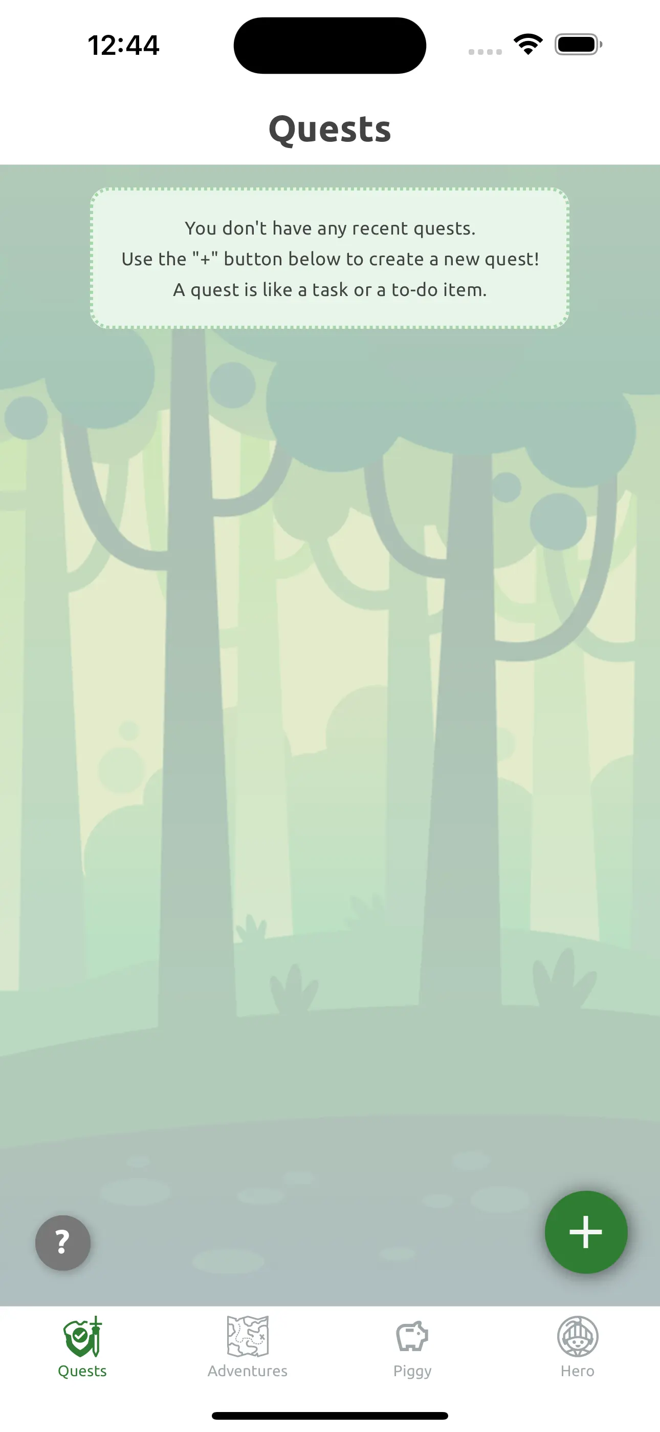
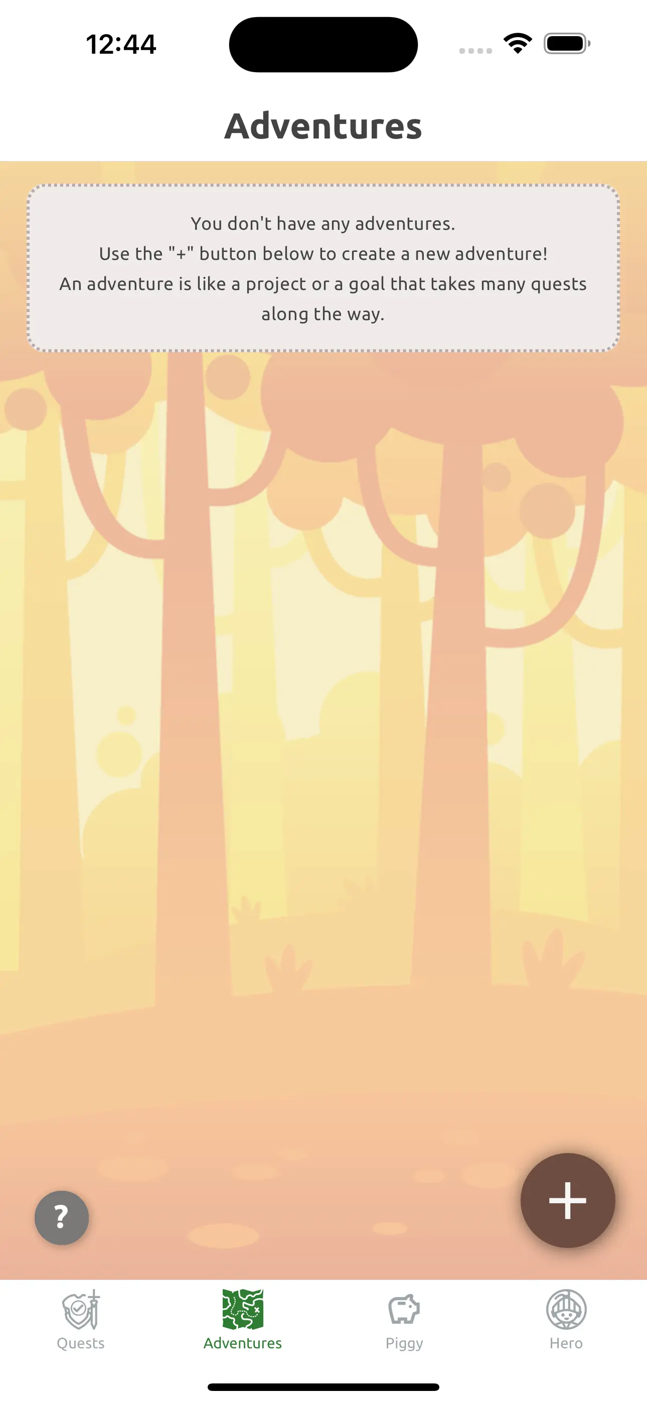
Above: Examples of "zero state" usage hints.
Information Centers
So far, we only provide new users just enough information to get started. But there are a lot of functionalities of HeroMode. For example, since HeroMode is a full-fledged task manager, it has a lot of features for organizing and even scheduling quests.
When we first launched HeroMode in 2022, we had prepared an online user guide called HeroGuide. HeroGuide goes into details on everything HeroMode has to offer. But let's be honest, who amongst us has gone and studied a user guide before using an app? Despite good intentions and efforts, HeroGuide has not been very helpful to users, as far as we can tell.
So we have implemented "Information Centers" directly within the app itself. These are popups that appear when the user needs more information on the functionalities on that screen.
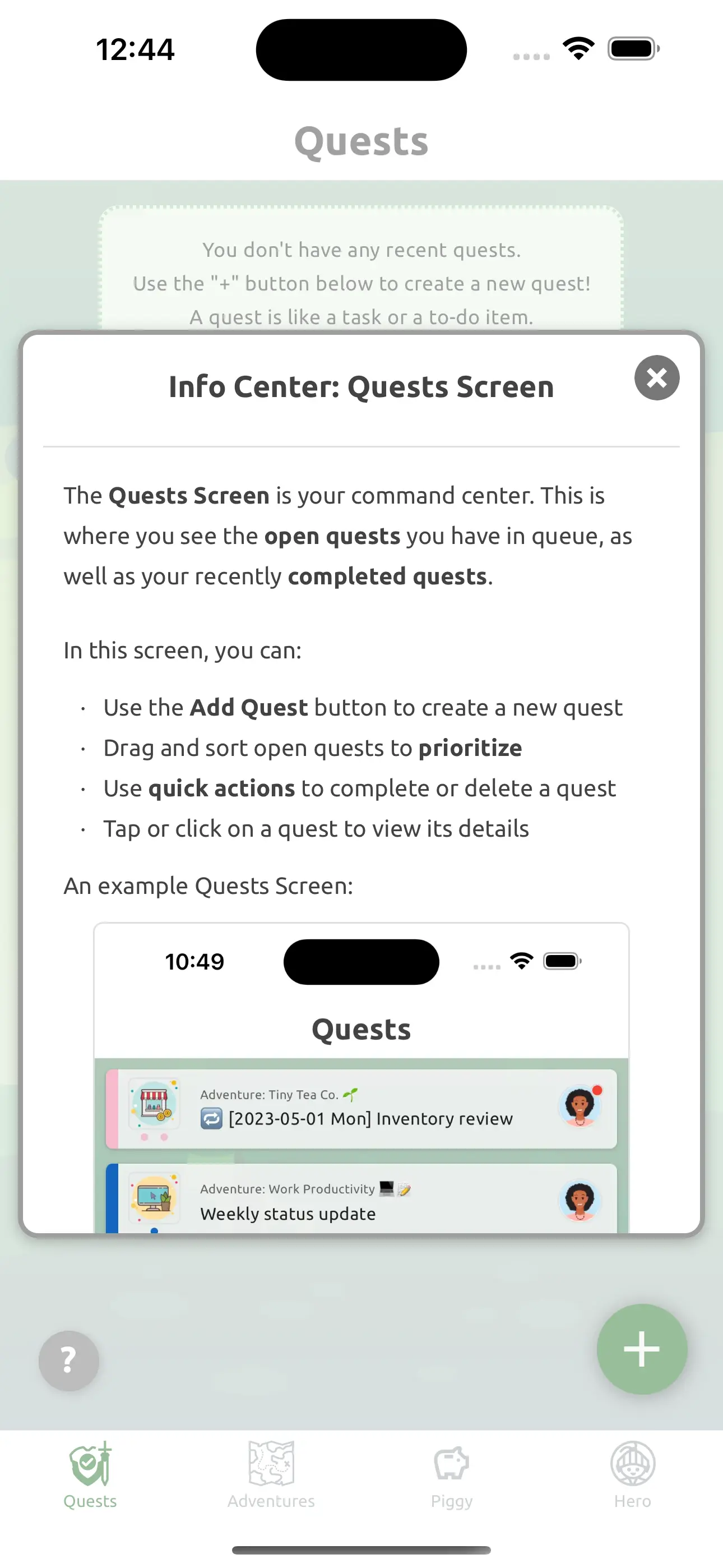
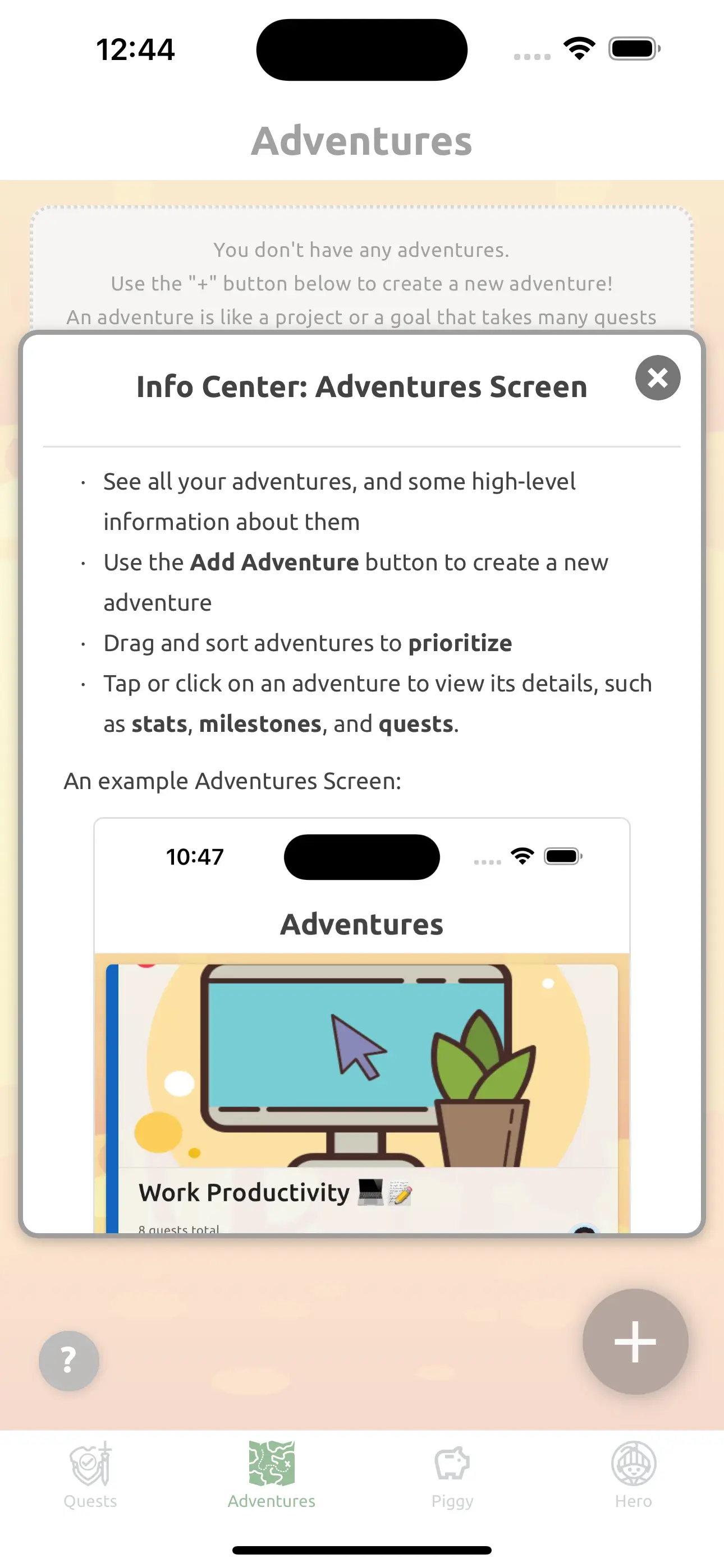
Above: Examples of Information Centers.
With Information Centers, we hope we are now providing relevant information to users just when they need it!
Adventure Templates and Gallery
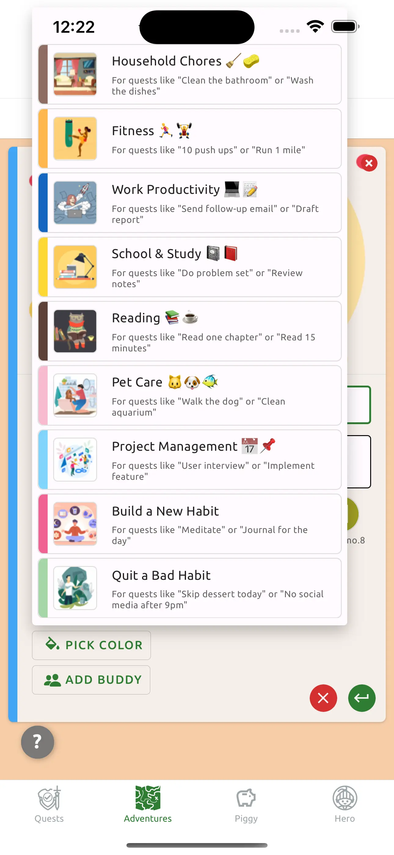
When the new user is ready to create a new adventure, we also want to make this significant step as easy as possible. As described in the previous releases, we have introduced Adventure Templates as well as the cover image gallery. These image options should make it more joyful for the new user to create beautiful adventures.
In-App Contact Support
What if the new user still has questions that are not answered by any of the above features? To make it easier to reach us, we have also added a "Contact Support" button directly in the app.
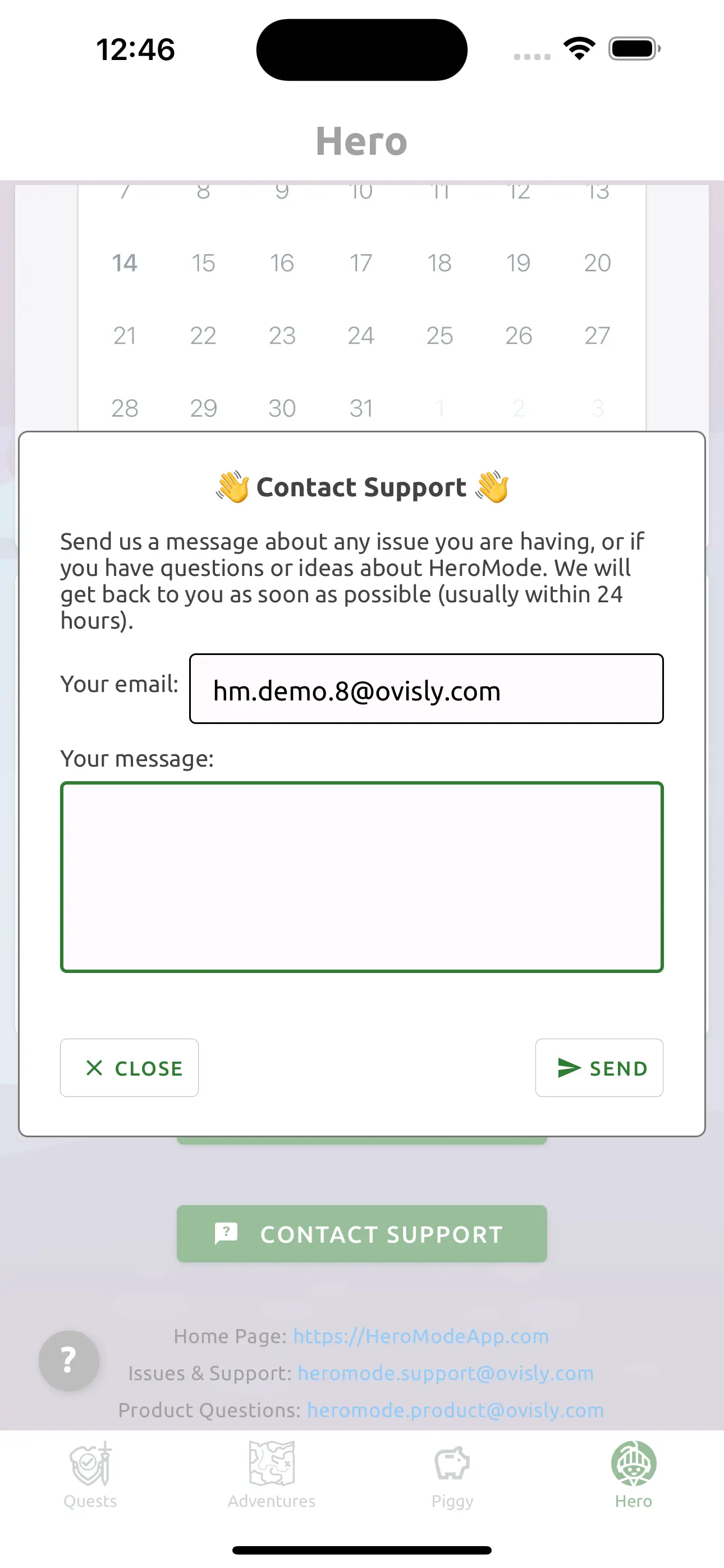
And it's not just for the new users! Any time you have a question, find a bug, or have an idea for HeroMode, you can let us know without even leaving the app!
A Better Day 1 Experience
We hope all these improvements, available with the release of v5.5, will give a better day 1 experience to new HeroMode users. Existing users should also find information center, adventure templates, and the in-app contact support features useful. As always, if you have any feedback, please let us know!