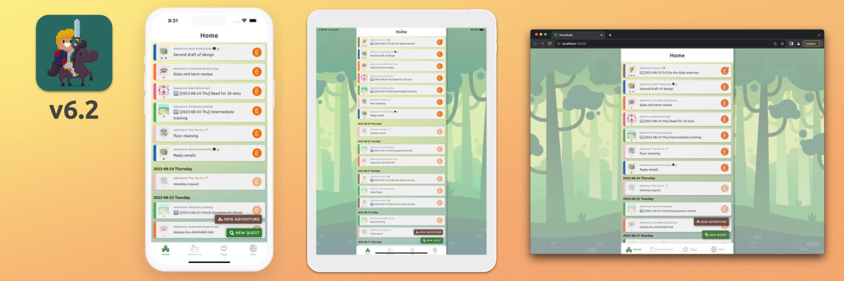
HeroMode v6.2 has been released! We now have a Home screen (rebranded from the Quests screen which has been a common source of user confusion), new navigation icons, and better UI for iPad and web. We hope you like it!
It was only last week when we released HeroMode v6, which significantly speeds up the app.
I was actually quite nervous for the release, as we had to make A LOT of changes to the entire codebase. But it has been rewarding to get user feedbacks like:
"It's so fast on all pages!"
"I haven't found any bugs!"
The second one really put a smile on my face!
Since then, we have been churning out more optimizations and features according to our roadmap. We have rapidly released v6.1 and now v6.2.
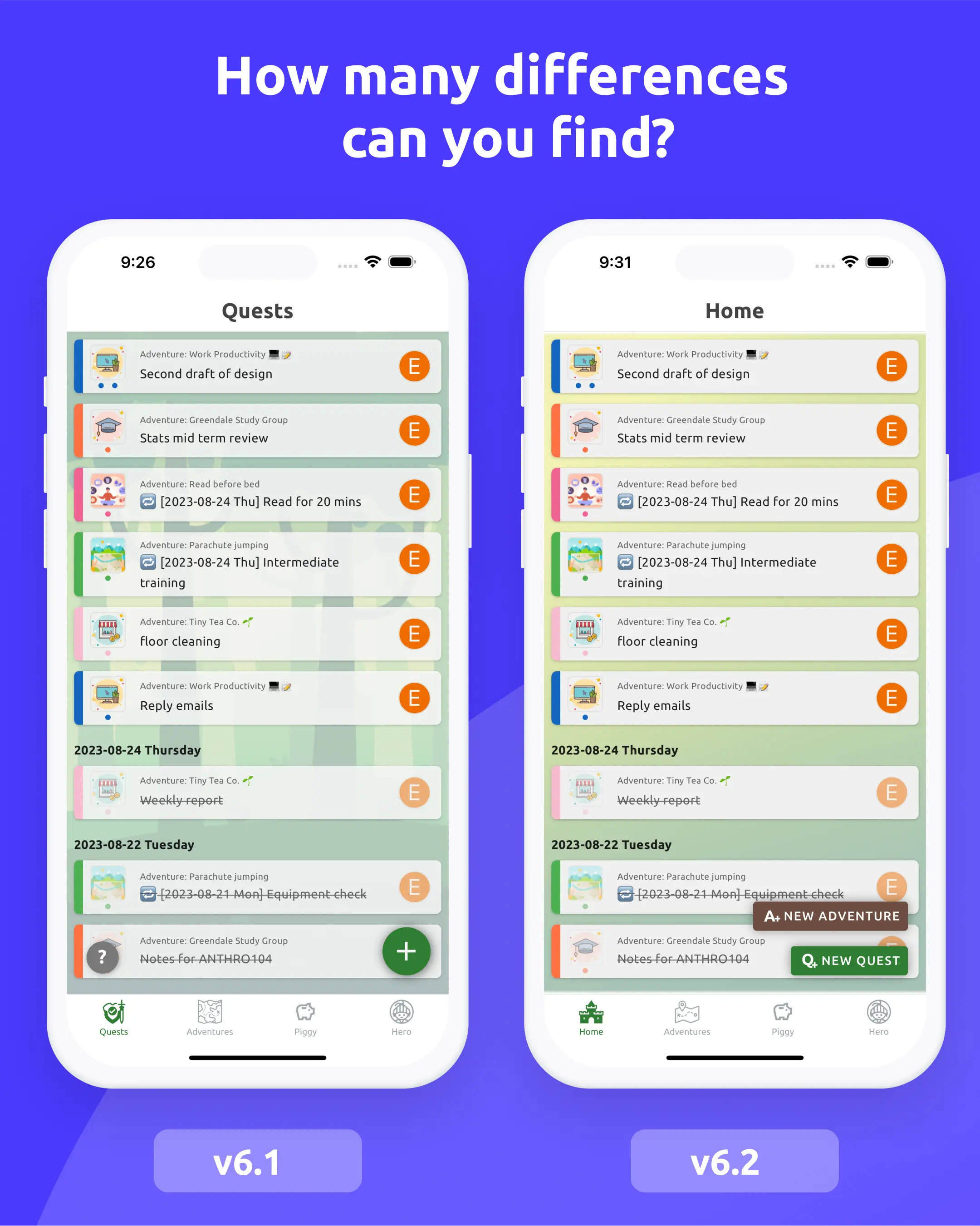
The new v6.2 has several UI updates. Here is a comparison with the previous version. Can you spot the differences?
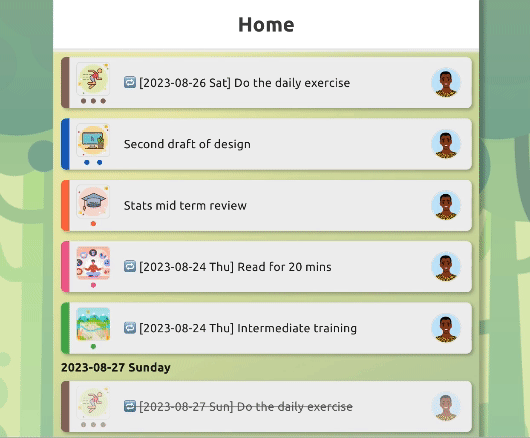
Finally, a Home Screen
Many apps you use, especially on mobile, have a home screen. It's a familiar way to navigate the app and all the information and functionalities within.
HeroMode's equivalent home screen is the "Quests" page - it's the first screen you see when you open the app. The Quests page displays the open quests you have, as well as those recently completed. You can sort, pin, and organize. You can complete quests, and create new ones. You can tap on a quest to get more details and options.
But because we call it "Quests" page, it's not immediately obvious that it's the "control center" of the app.
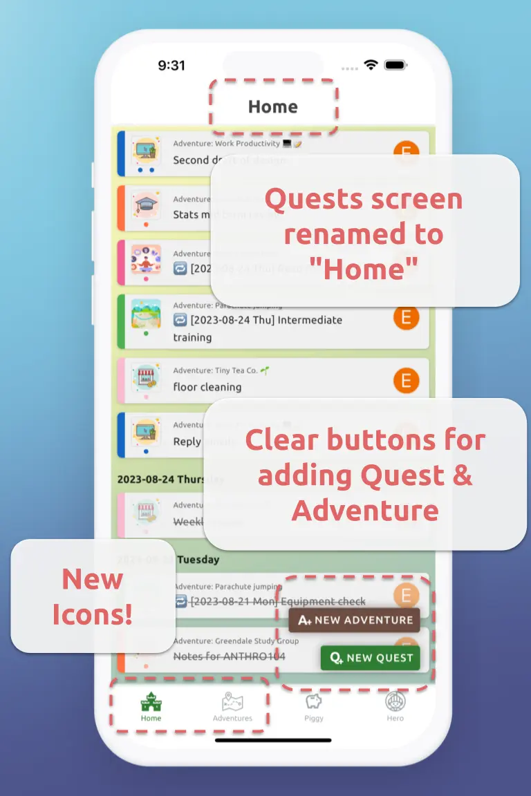
In v6.2, we have renamed the "Quests" page to simply "Home".
In addition, users can now create new adventure directly within the Home screen, without having to go to the "Adventures" page first. This way, the Home screen is truly the "control center" of the app - you can create new adventures, new quests, and organize them. We hope this update will make it easier for new users to get started with HeroMode.
New Icons!
Now that the Quests screen is rebranded as the Home screen, the old "Quests" navigation icon needs an update.
Thanks to SVG Repo and some mild Figma-fu, we now have a new navigation icon for the Home screen! And while we are at it, we also simplified the "Adventures" navigation icon.
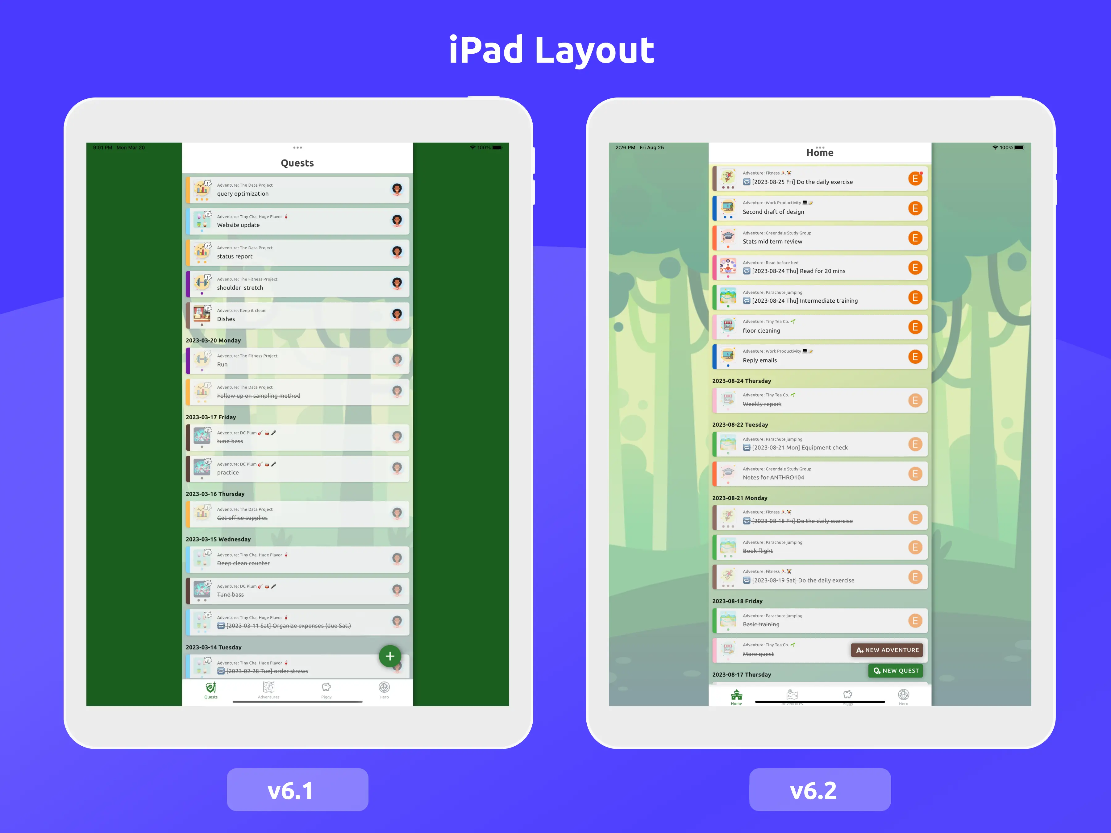
iPad & Web App Layout
iPad and web app layouts have always been challenging for us. We want the app to have a consistent, mobile-first experience. But we also want all HeroMode users to enjoy a pleasant UI on all devices. With the much larger screens on iPad and web, we haven't been able to find a good balance.
In v6.2, we still don't have a perfect solution. But we are utilizing background images to make the app more visually appealing. Compare to v6.1, I hope you will agree that v6.2 looks much better on iPad and web!
What's Next?
We are like hungry hungry hippos, except instead of eating marbles, we are spitting out features! Here is a quick preview.
Simplify Quest Card
Each quest card is doing a lot. It's jam packed with information. And for good reason - you need to know which adventure is the quest from (context), how many points it's worth (motivation), and who is the quest assigned to (collaboration). Plus the color theme (organization) and adventure icon (visual appeal). Not to mention the most important part - the quest description itself!
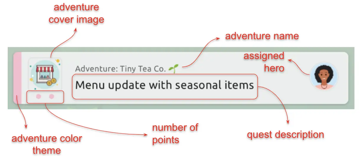
Above: Each quest card is packed with information. Maybe too packed. What if we can reduce the clutter?
We've gotten user feedback that the quest card is too cluttered. This feels distracting, and distraction is not good for productivity. So in the upcoming release, we are making it possible to hide the adventure title. Just click on the adventure icon, and you can hide and show the title.
Above: Coming soon - ability to hide and show adventure titles.
Level Up!
We have wanted to add a leveling up mechanism for a long time. It's a great way to motivate. We have been working on implementing this feature, and soon you will be able to level up for each adventure! If you have buddies for an adventure, you will also be able to see their levels!
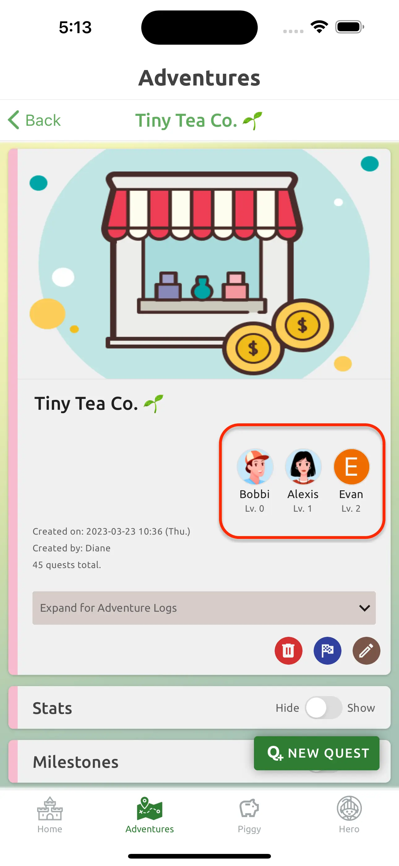
Above: Coming soon - adventure levels.
That's all for now. We hope you enjoy the new v6.2!
PS
If you tried to find the differences between v6.1 and v6.2, here is the answer:
- "Quests" page has been renamed to "Home".
- Quests and Adventures navigation icons have been updated.
- Instead of the green plus button, we now have two buttons for "New Adventure" and "New Quest".
- The background is now a green gradient instead of the forest image.
- Quest cards used to have slight transparency, but now they are solid in v6.2. The goal is to remove distractions in the quest card.
- The Question mark button on the lower left corner for Information Center is not there in v6.2. We are temporarily disabling this feature since we will need to update its content.
I think that's all? Did I miss anything? Okay here is a bonus one that doesn't really count but mad respect if you noticed it:
- v6.1 screenshot was done at 9:26, whereas the v6.2 one was done at 9:31.