

A few months ago, I wrote about clawing my way out of Piggy Debt. In that post, I shared charts showing my coin balance over time. I learned a couple of lessons in that exercise. First, data is motivating. Seeing my progress makes me want to do more. Second, it shouldn't have been that much work. I spent one full day pulling data manually, writing analysis script, and visualizing the trend.
Now, with HeroMode v7.0, you can see your Piggy Coins Trend directly in HeroMode!
Data is Motivating
There's something powerful about seeing your progress laid out in front of you. A chart going up and to the right tells a story of effort and persistence. It makes you want to keep going. This is why fitness apps show you streaks, and why financial apps show you your savings grow over time.
Piggy Balance Trend
We recognized that HeroMode should make it easier for users to see their data and progress. So we started working on bringing this kind of visualization directly into the app. It wasn't easy, but it is done! Now you can see your balance over time right from the Piggy screen. Choose from different time ranges: 7 days, 1 month, 6 months, year-to-date, 1 year, or your entire history.
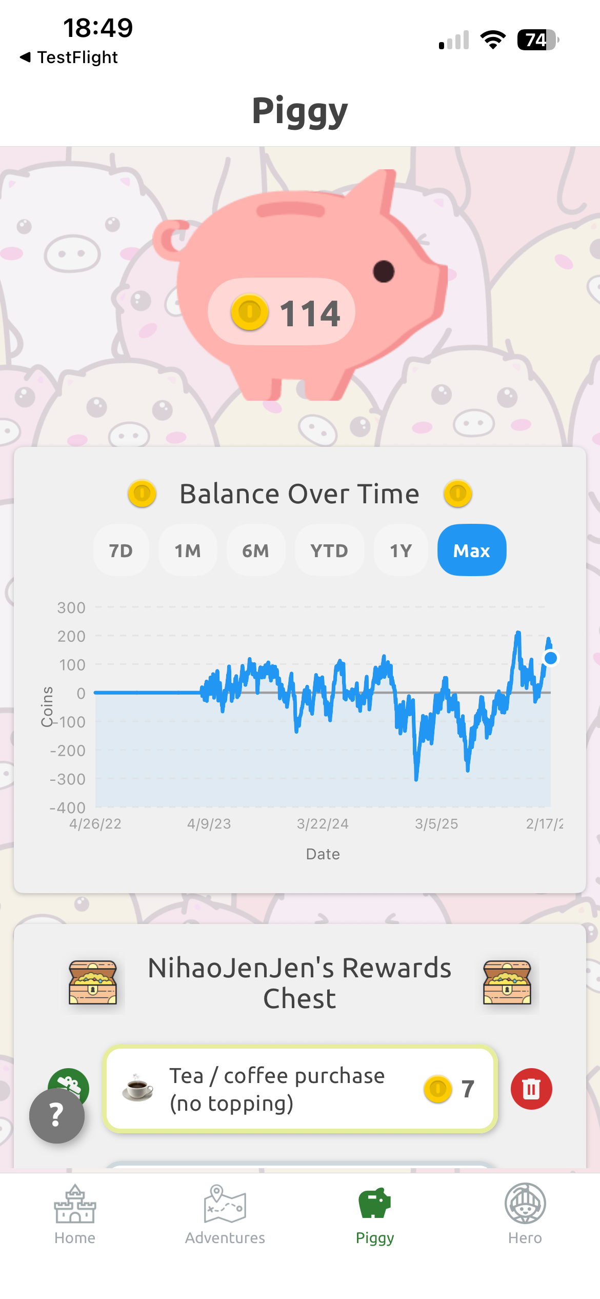
Above: The new Balance Over Time chart in the Piggy screen.
What's Next
This feature required a significant backend overhaul. Now that we've done the heavy lifting, we're excited about the possibilities. Expect more analytical features in the future. We're also looking forward to making the app snappier, since a lot of calculations that used to happen on device can now be offloaded to our servers.
Check out HeroMode v7.0 and let us know what you think!